Project Overview
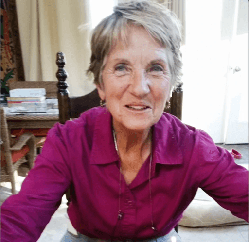
Drawingwriting.com is a website owned by an author, educator, and doctor in education whose lifes' work is centered around improving literacy.
Drawingwriting.com details teaching philosophies and resources (workshops, books and other publications) to students and parents to improve their literacy skills.
I was brought on to redesign her website, which was largely left untouched for 15 years on an outdated web platform.
Role
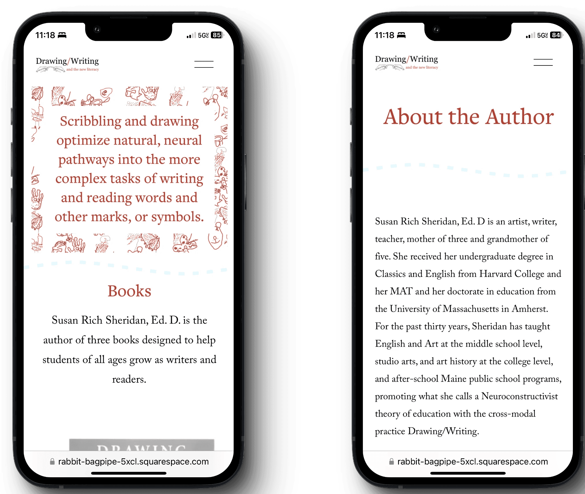
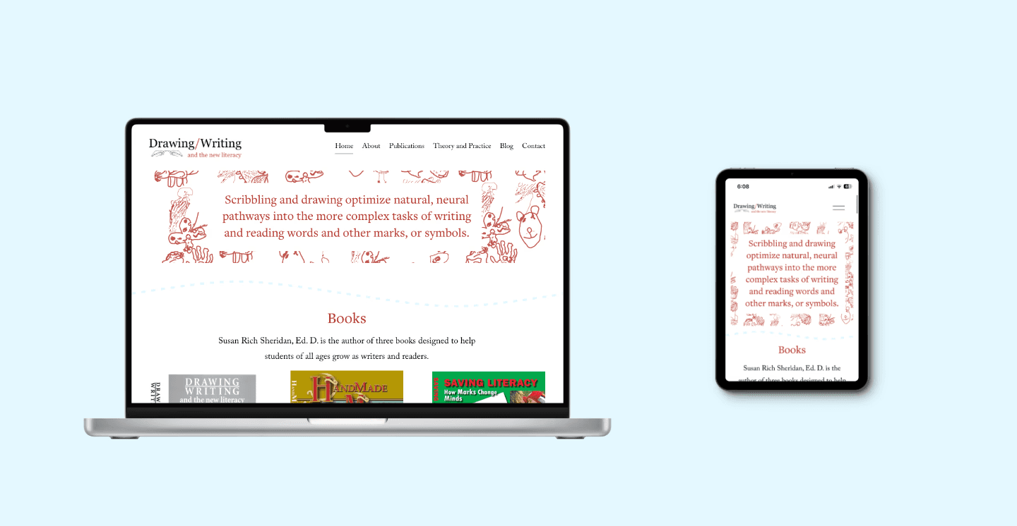
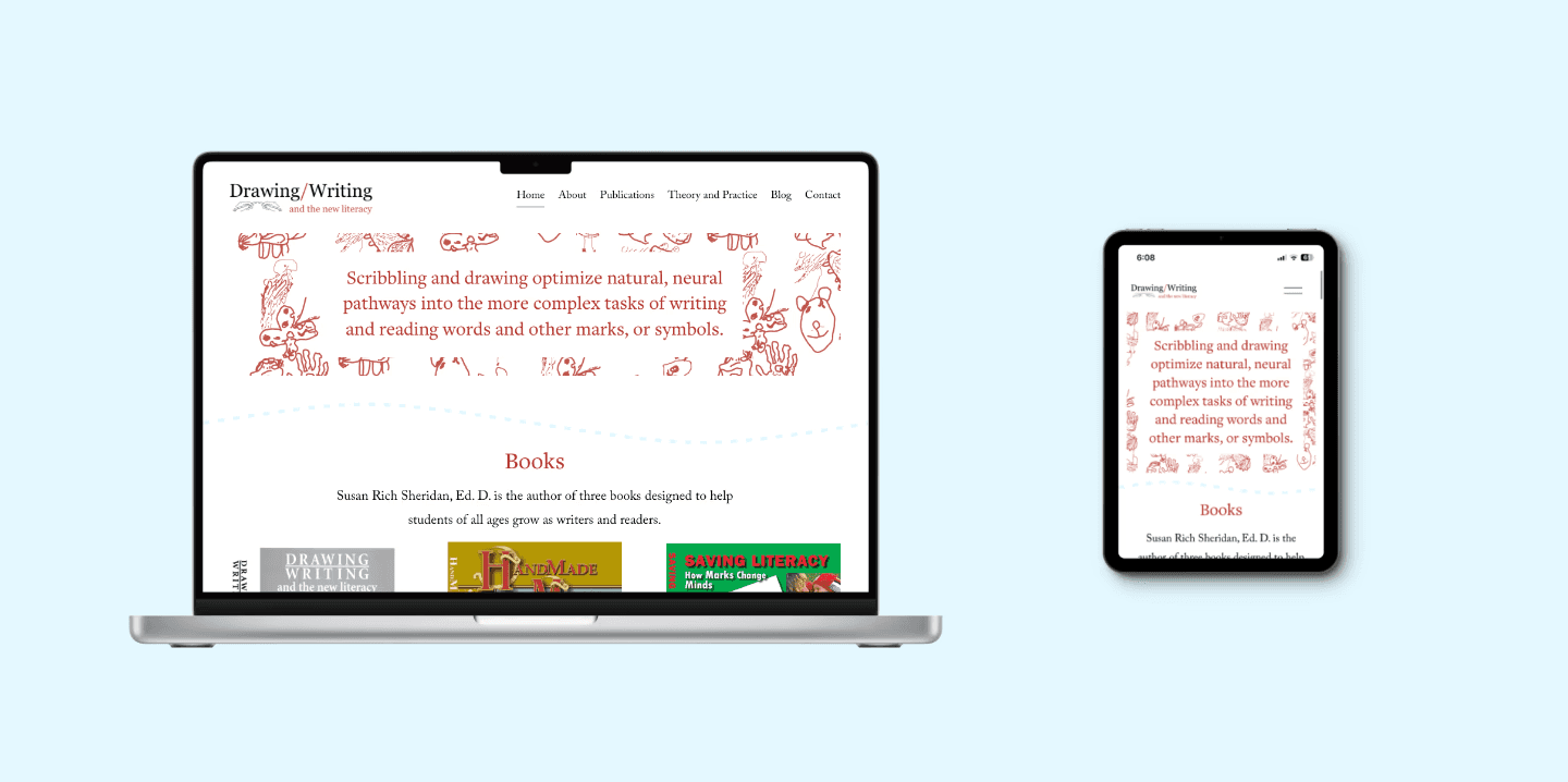
Designed new information architecture, responsive web pages and built an entirely new site using Squarespace.
Moved website content from outdated platform and transferred site domains.
Collaborated with client each step of the way to present developments, answer questions and address clients' concerns.
Tools
Figma

Weebly

Squarespace
{...}
CSS
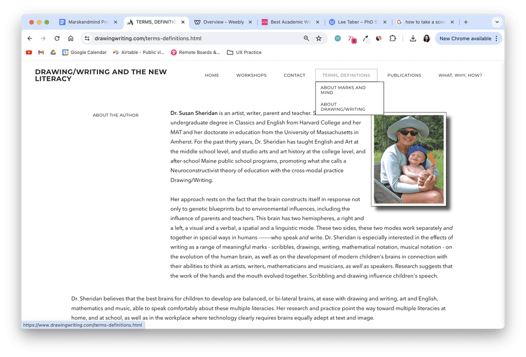
My client is a talented author, that has 3 published books and multiple scholarly publications related to their doctorate in education.
For over 15 years, their life's work was on a website hosted with Weebly and was not maintained. Therefore, it did not appeal to the current visitors or drive traffic to their works.
Aside from modernization needed—boosting SEO, checking for updated links and messaging— the website needed an updated look and design.
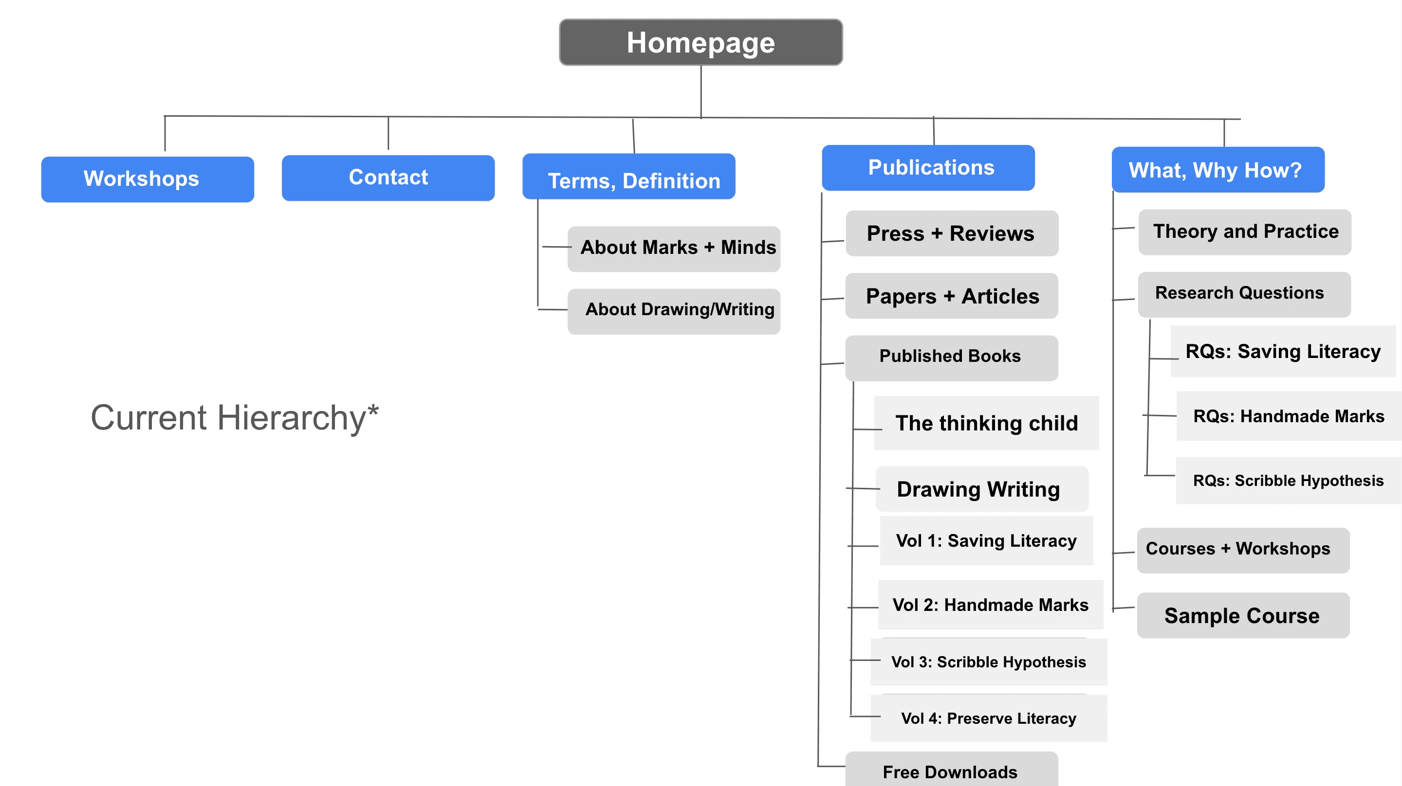
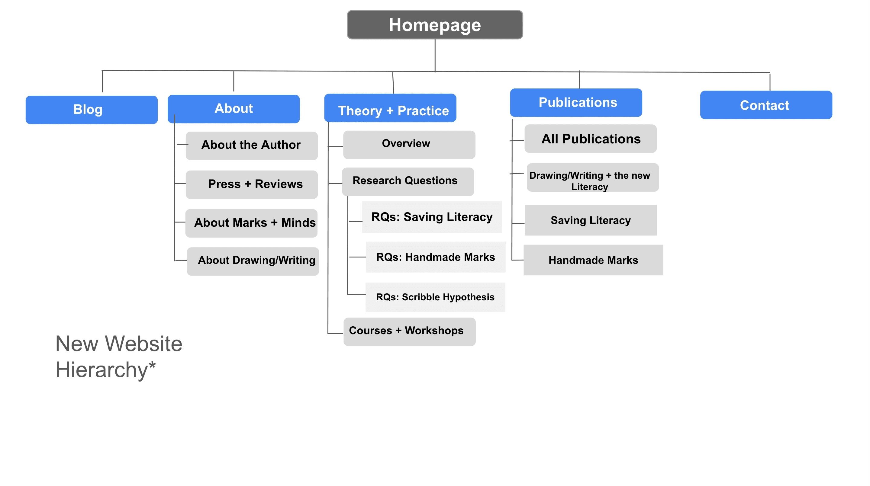
A lot of the content on the website was valuable and didn't need to be completely abandoned. I went through each page with my client, verified what was important to keep on to the new website and organized the content in a way that is easily navigable for their audience.
My approach was to audit the current site to look for redundancies and areas of improvement, and then reimagined what an experience that focuses on the end user's goals would be like.

Centering our User
Throughout the project, it was imperative to consider the users of this website. I met with my client early to hear their perspective on the intended users of their website and what their goals are.
Since my client's work revolves around improving the literacy of humans through drawing and writing, many of the users of this website want to learn about Susan Rich Sheridan, Ed. D's teachings, workshops and books and what her tools and resources can do for their child, or for themselves.
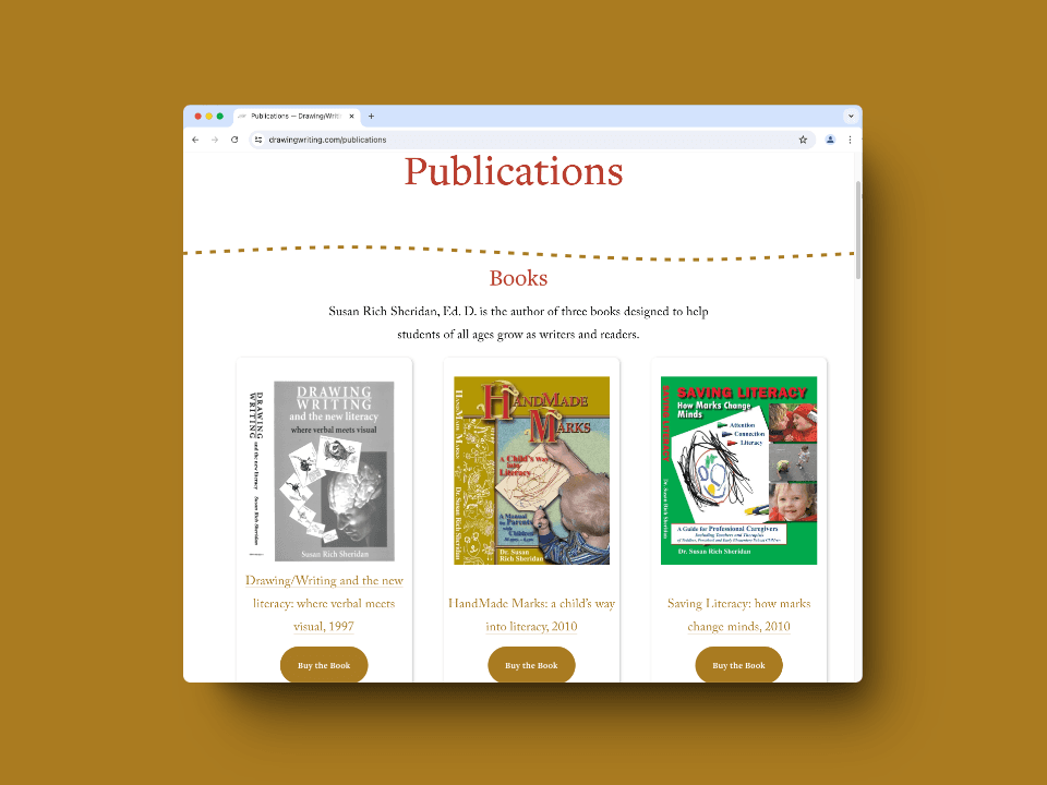
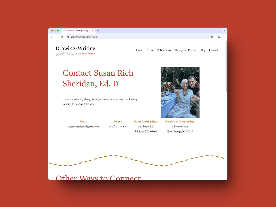
Although every user is unique, the main purpose of the website is to help them easily access information that is relevant to their needs. With the new website, that means providing multiple paths for users to: view my clients' Books; get in contact with her; and learn about her credentials and methods.
Based on this insight, I started hypothesing what areas can be improved upon to help users achieve their goal.
Key Areas to Improve

Text Heavy Website
Each page contains long blocks of text. Although the content is valuable, the redundancies across the site make it hard for users, especially those less strong in literacy, to obtain this important information and follow along efficiently.
Plain Outdated Webpages
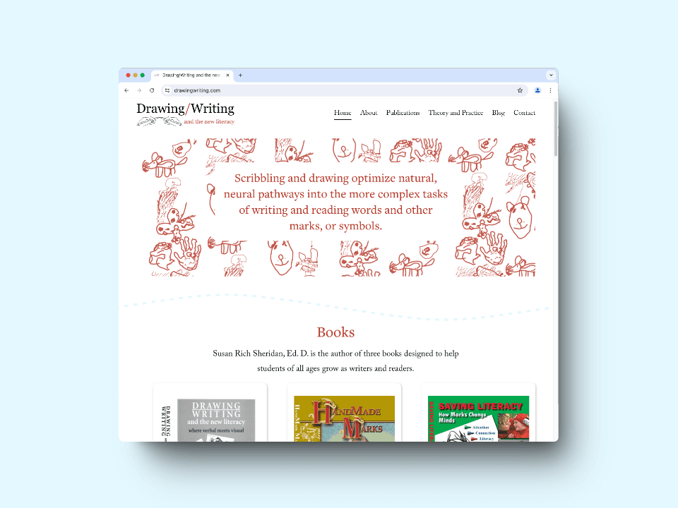
The old site featured images/graphics that were out of date, and did not reflect my clients' brand! The website needed to reflect my clients' brand which is about writing and scribbling.

Unclear Titles
Navigation across the website is confusing and inconsistent. Titles in the menu do not clearly indicate the content on the page. For example, the "Terms, and Definition" tab takes you to view my client’s CV and awards.
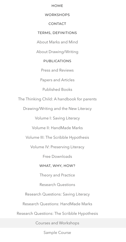
Disorganized Informational Structure
Before executing design, I brainstormed ways to simplify the menu structure of the website.
Auditing Competitors
I reviewed indirect competitors, ie. other authors that have academic, professional material to get inspiration for ways to highlight works and organize content.
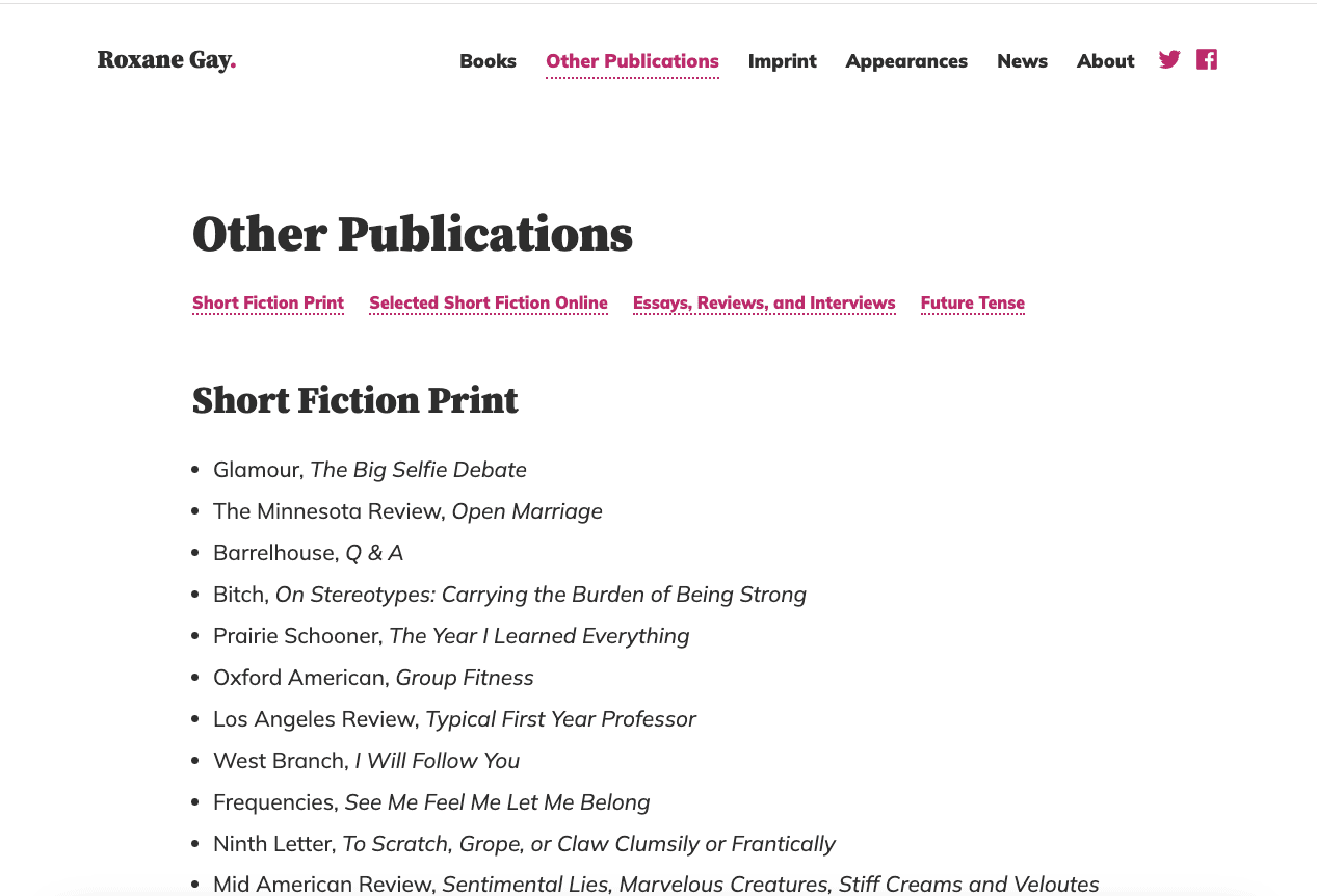
Ann Handley's website is very content heavy, but is broken up in ways that engage the user, like in this example shown.

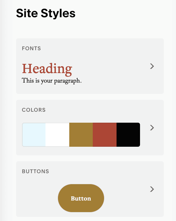
Color and Design Guide
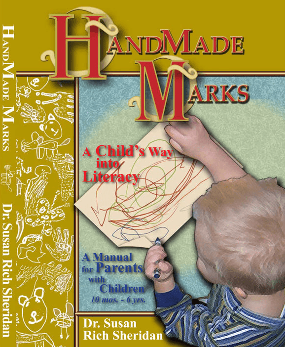
We wanted to incorporate their books' color scheme and images into the theme and design of the new website.
Initial Mockups
I mocked up a few page layouts for the new website on Figma to give my client an idea of the look and feel of the new website. I also gained feedback early and often before and while designing the pages.
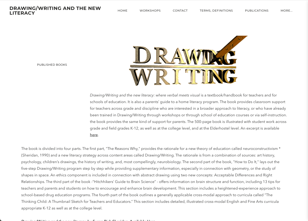
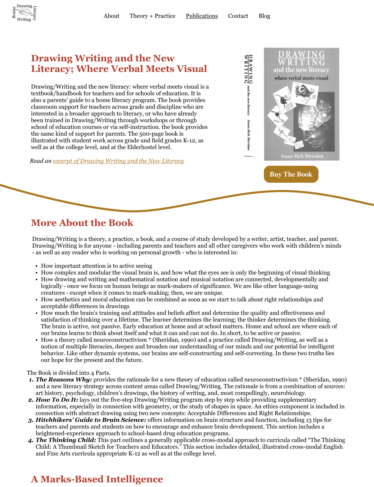
The original page (left), has a lot of valuable text, but has outdated imagery, and long blocks of text that would be difficult for users to read. The first mockup (right) sections out the text with headers, lists, and a cover of the book, while also linking to the book where users can directly make a purchase on Amazon!