Designing a responsive website for a pottery studio.
Summary
I was challenged to design a signup process on a responsive website for a pottery studio.
Ceramix Studio welcomes both hobbyists and artists alike to attend their classes.
Objective
To design a responsive user-friendly website that represents Ceramix studio and allows potters to sign up for classes online.
Role
This was a project that I researched and designed all on my own, therefore I was lead UX Designer and Researcher.
Tools
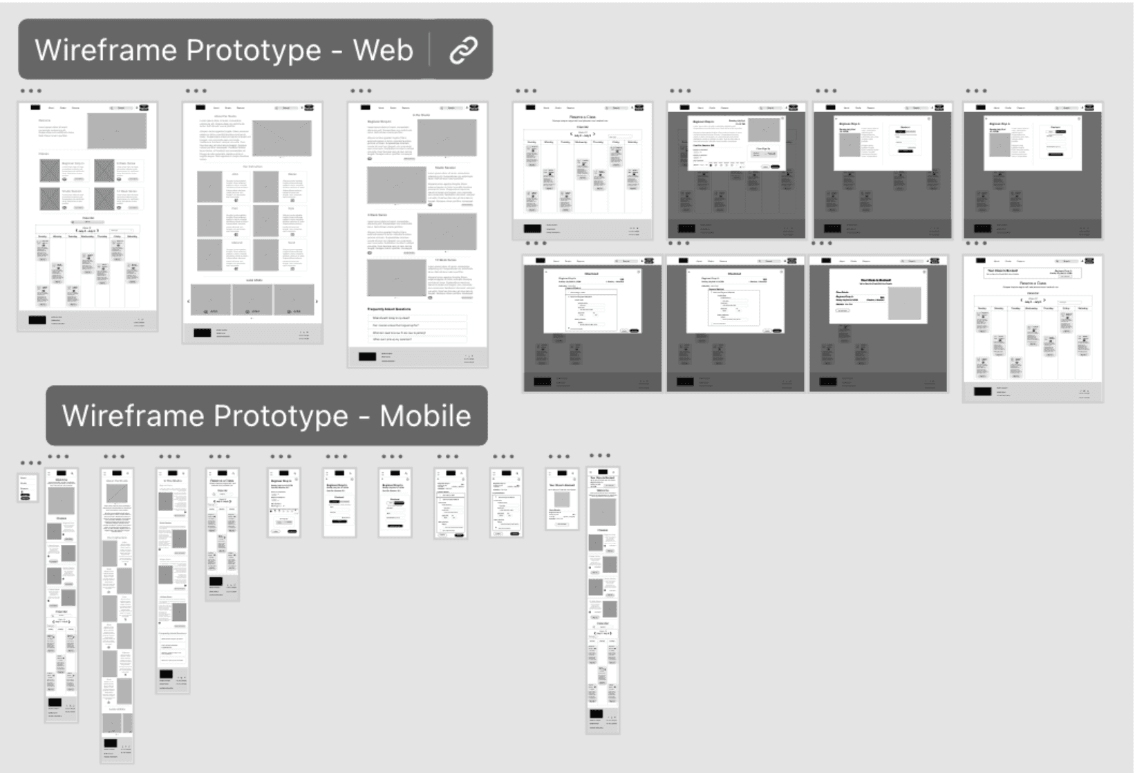
Adobe XD
Initial Research
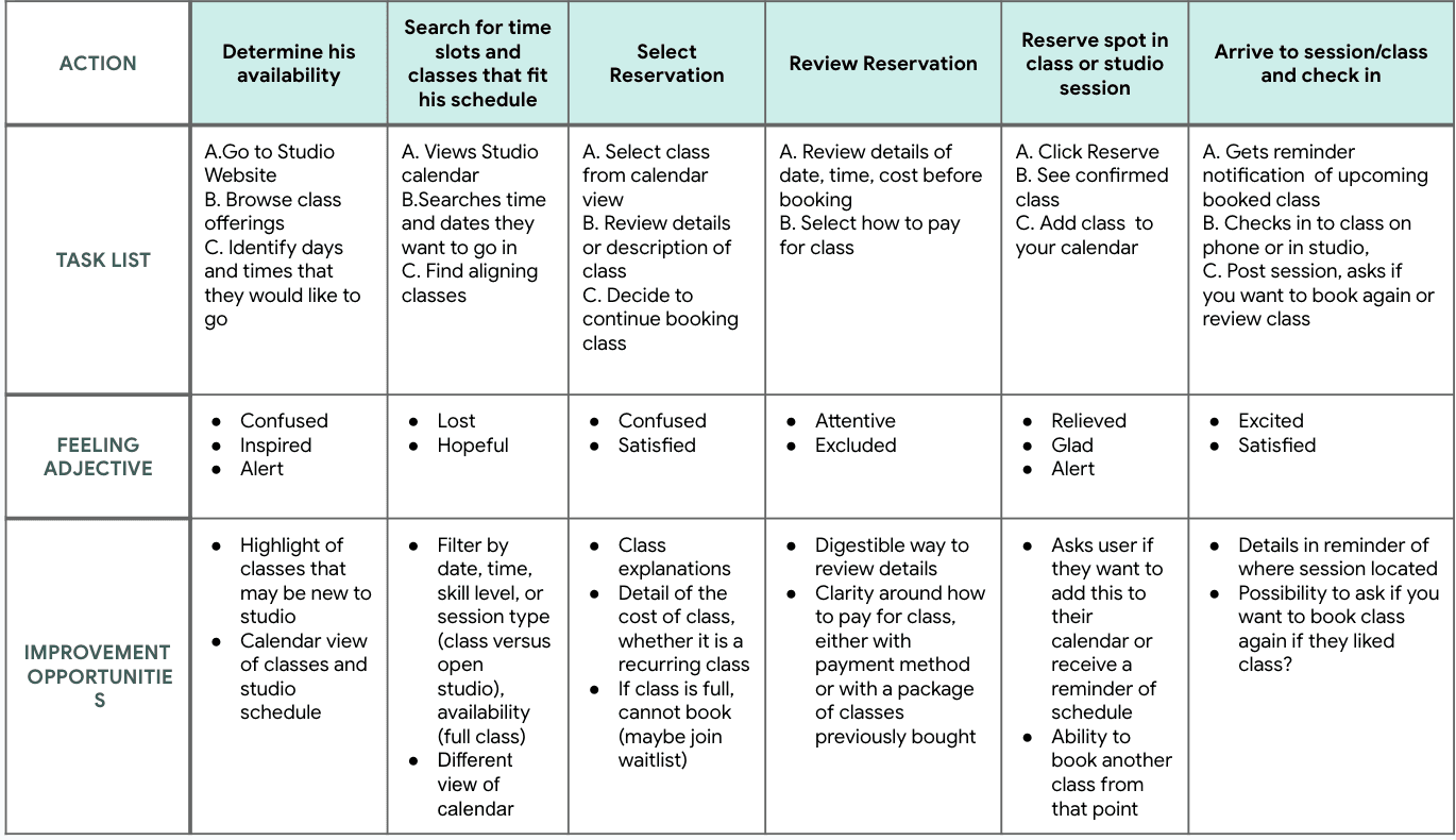
Availability
Some people in our user group work 9-5 jobs, while others have less routine schedules. People said limited availability of classes would prevent them from signing up for a class.
Class Information
For novice or intermediate ceramicists, it can be confusing to know which class and level is right for them and what they are looking for.
Confirmation
Confirmation after booking a class is important feedback for people who are new to the signup process and the website itself.
Reminders
Our user group has many activities and responsibilities on their calendars, so it is easy to forget what time and day their booked class is unless our process reminds them of their scheduled session.

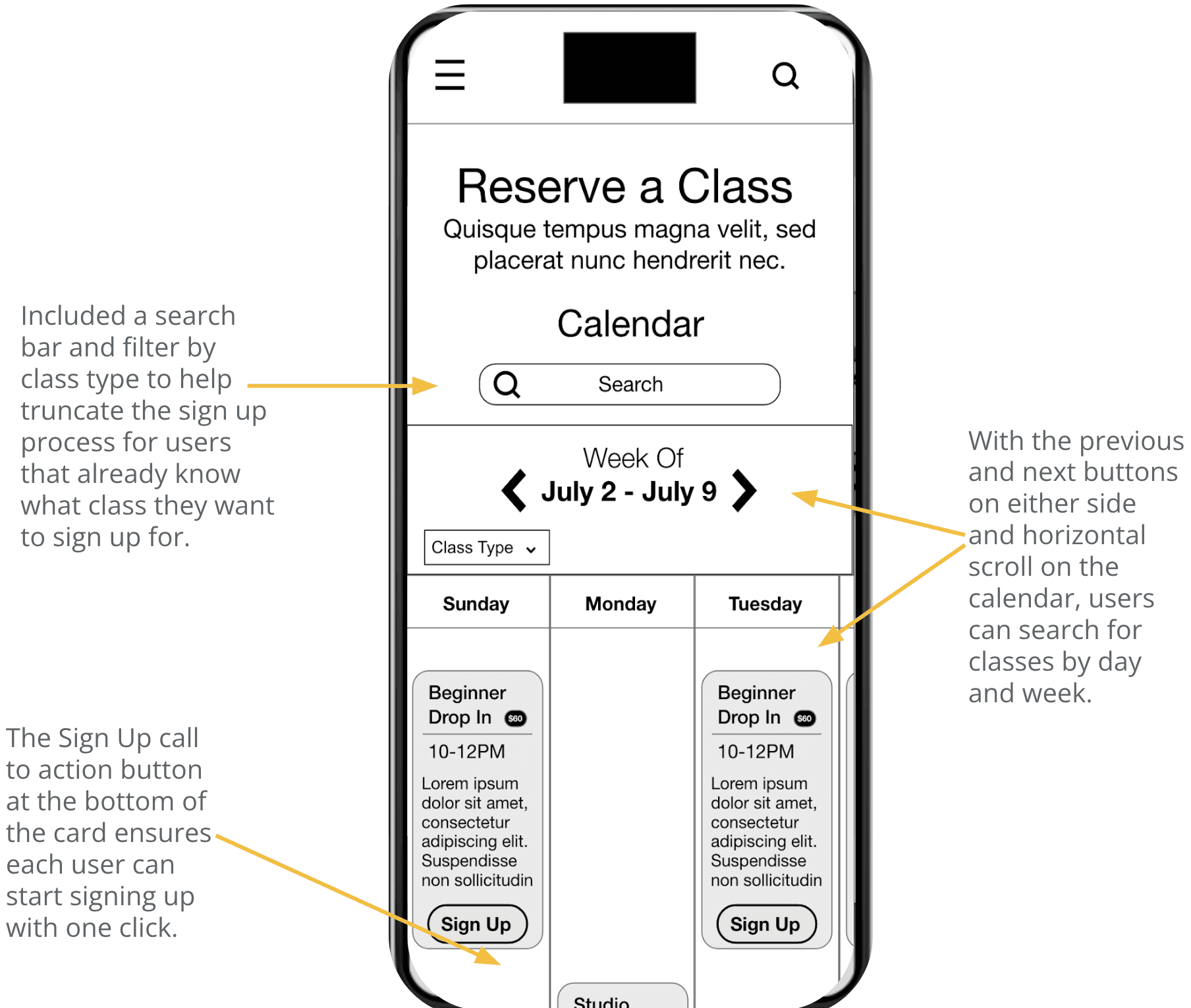
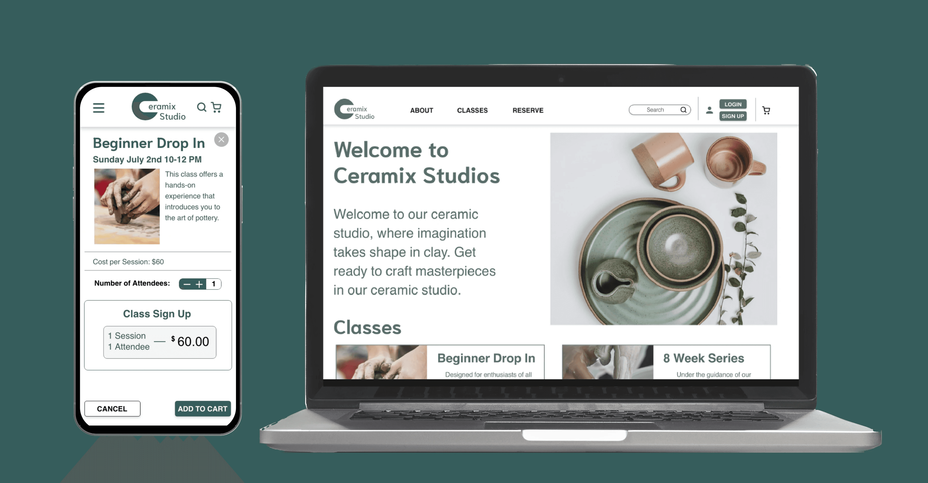
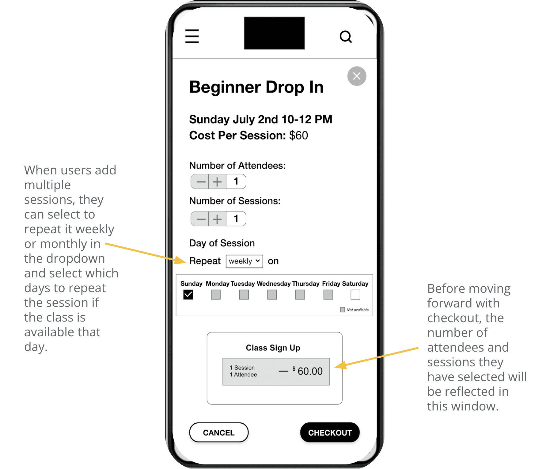
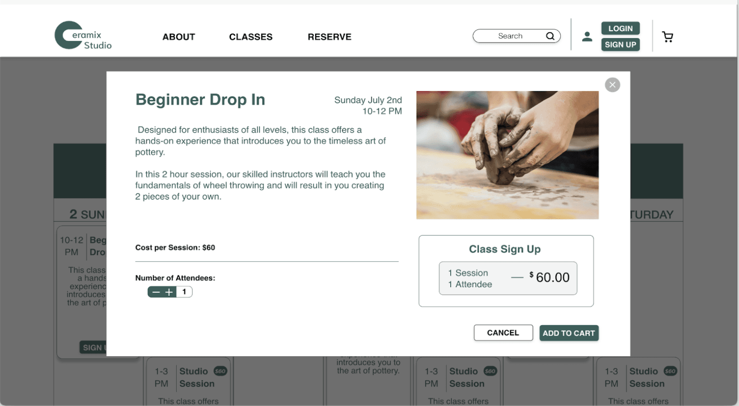
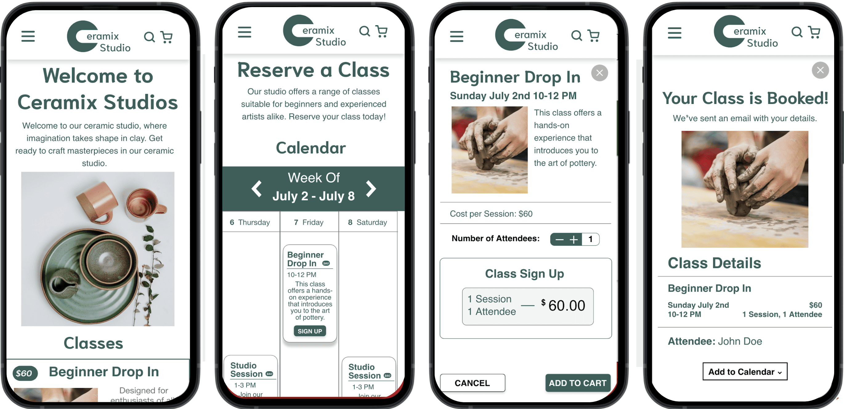
After users select Sign Up from the Reserve page, important details for the class like date, time, and cost appear. Users can change number of attendees if they want to sign up a friend and change the number of sessions if they want to repeat the class weekly on the same day or again on a different day when the class is available.
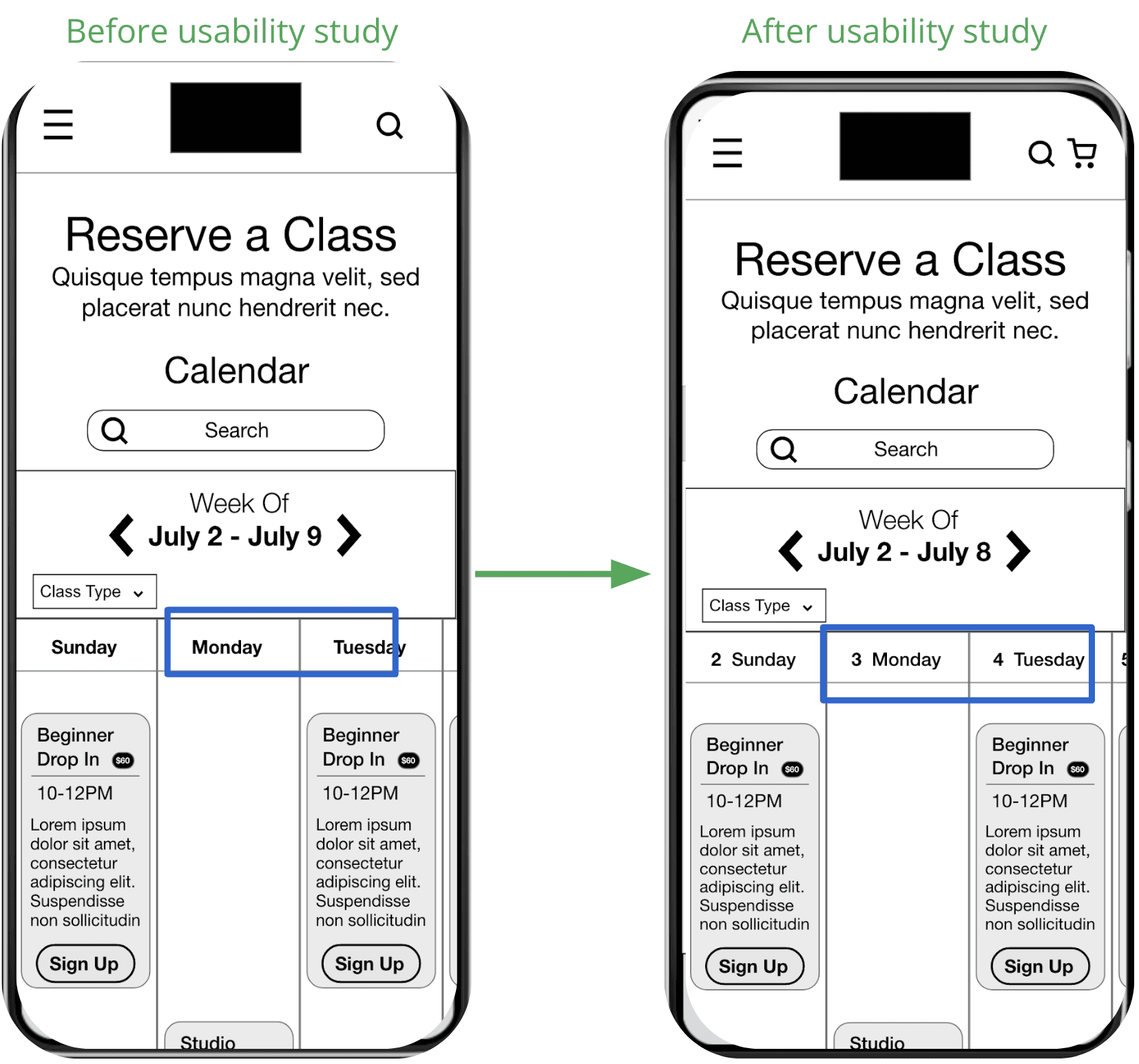
1
Include Date in Calendar
2
Reconsider repeat session feature
3
Include Date in Calendar
Changed the calendar to show which date correlates to the day of the week.
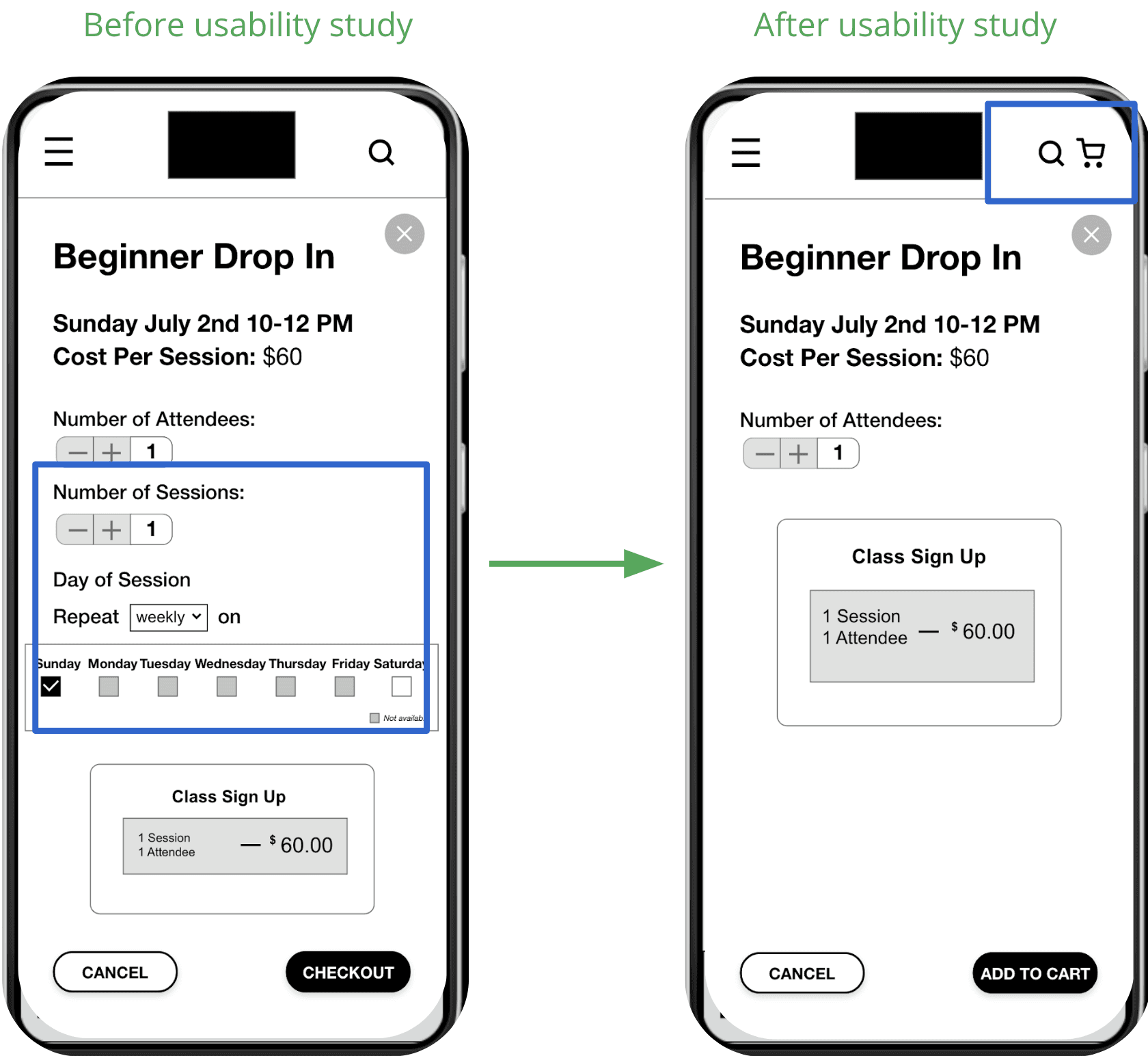
Reconsider Repeat Session Feature
If users want to now book many classes, they can add them to their cart and review and checkout by clicking on the cart icon.
Outcome:
The responsive website I created offers a seamless sign-up process that accommodates users on any device.
Both artists and hobbyists can easily find what they are looking for and sign up for their preferred class in 3 steps.
What I learned:
Simplicity in design and presenting the most important information to users was a focal challenge in this project.
Designing for web and mobile devices that have limited real estate makes it critical to prioritize the most important information that aids users in the journey.
This project also refined my skills in Adobe XD.
1. Increase Testing
More testing with more users!
2. Expand Sign-up Process for Recurring Visitors
Explore desiging a checkout process for signing up and buying multiple classes.
3. Personalize the Experience
Add some personalization to the website for recurring customers.